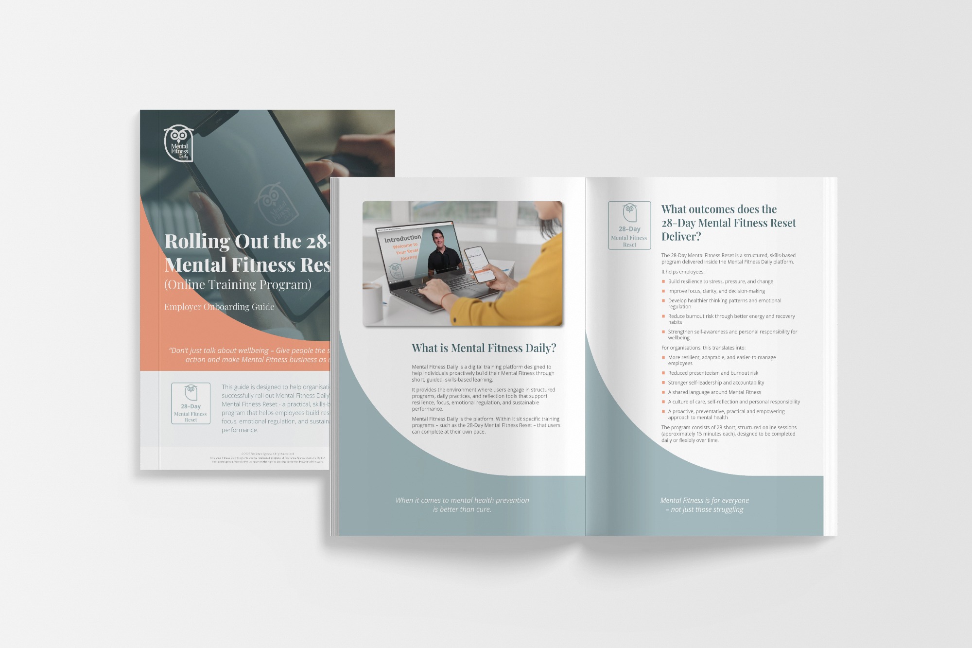
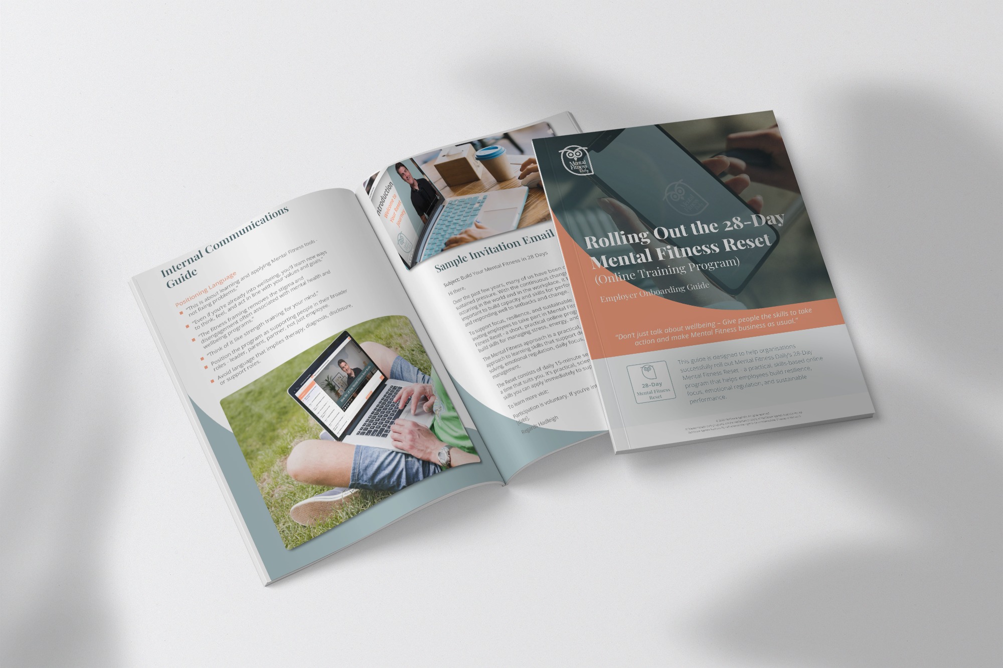
As part of the ongoing partnership with Resilience Agenda, I developed a comprehensive program guide designed to support one of their core initiatives. The guide translates the brand’s mission into a clear, structured, and visually engaging resource for participants.
The project reflects the deep understanding built over years of collaboration — ensuring that every element, from typography to layout, aligns with the brand’s identity and serves its purpose.
What Was Done
Layout & Structure
Created a clean, intuitive layout that guides readers through the program’s content
Organised information into logical sections: objectives, methodology, participant journey, and resources
Balanced text and visual elements to maintain engagement while ensuring clarity
Visual Identity
Applied Resilience Agenda’s established brand language consistently throughout
Used the brand’s colour palette, typography, and graphic style to create a cohesive experience
Incorporated illustrations and icons to support the content without overwhelming it
Production & Delivery
Prepared print-ready files with precise technical specifications (bleed, colour profiles, resolution)
Ensured the guide is suitable for both professional printing and digital distribution
Delivered source files for future updates if needed
The Value
This program guide is more than a document, it’s an extension of the Resilience Agenda brand. By maintaining visual and tonal consistency with the broader identity, the guide reinforces trust and credibility with participants.
Over six years of collaboration, this level of alignment has become second nature. Briefings are shorter, revisions are minimal, and the result always feels intentional.
