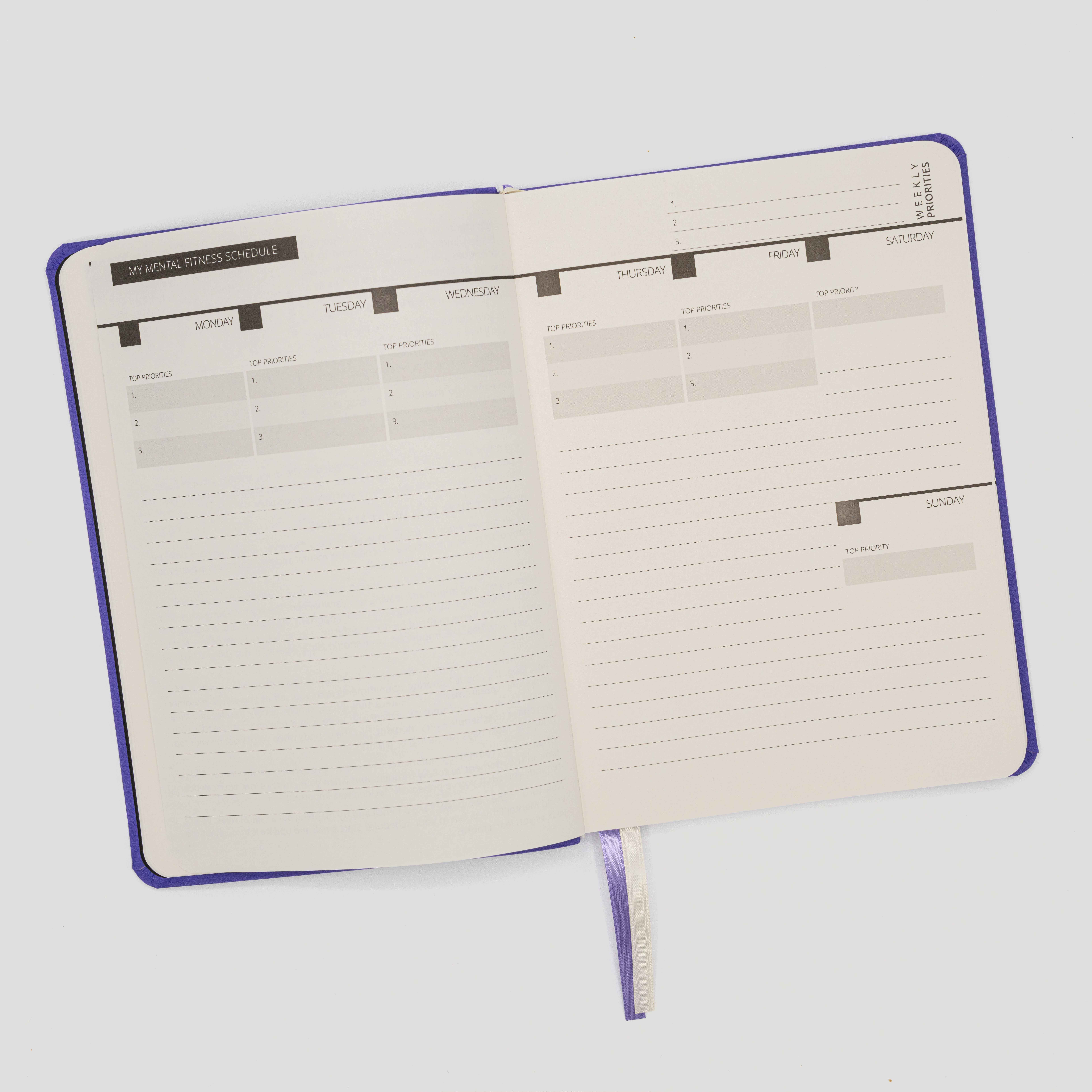
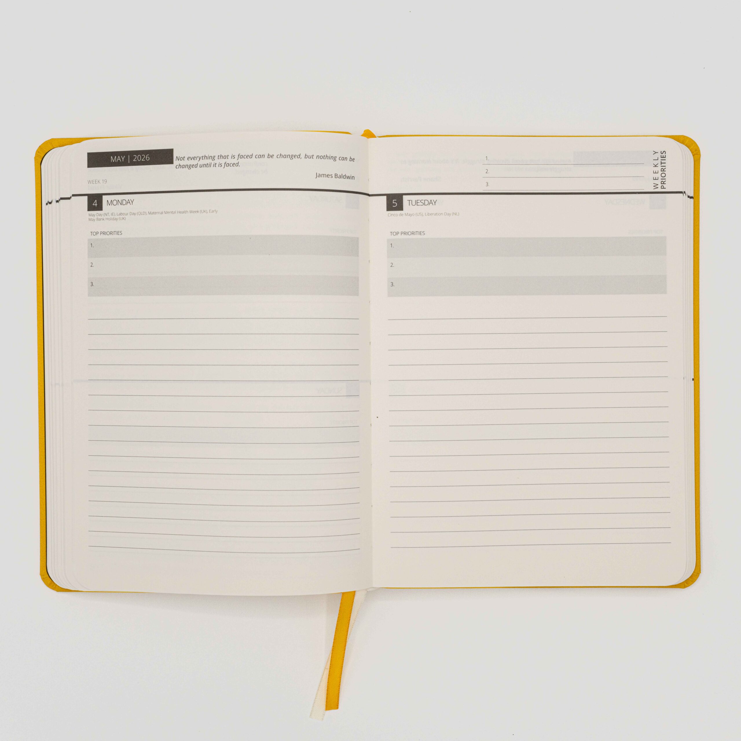
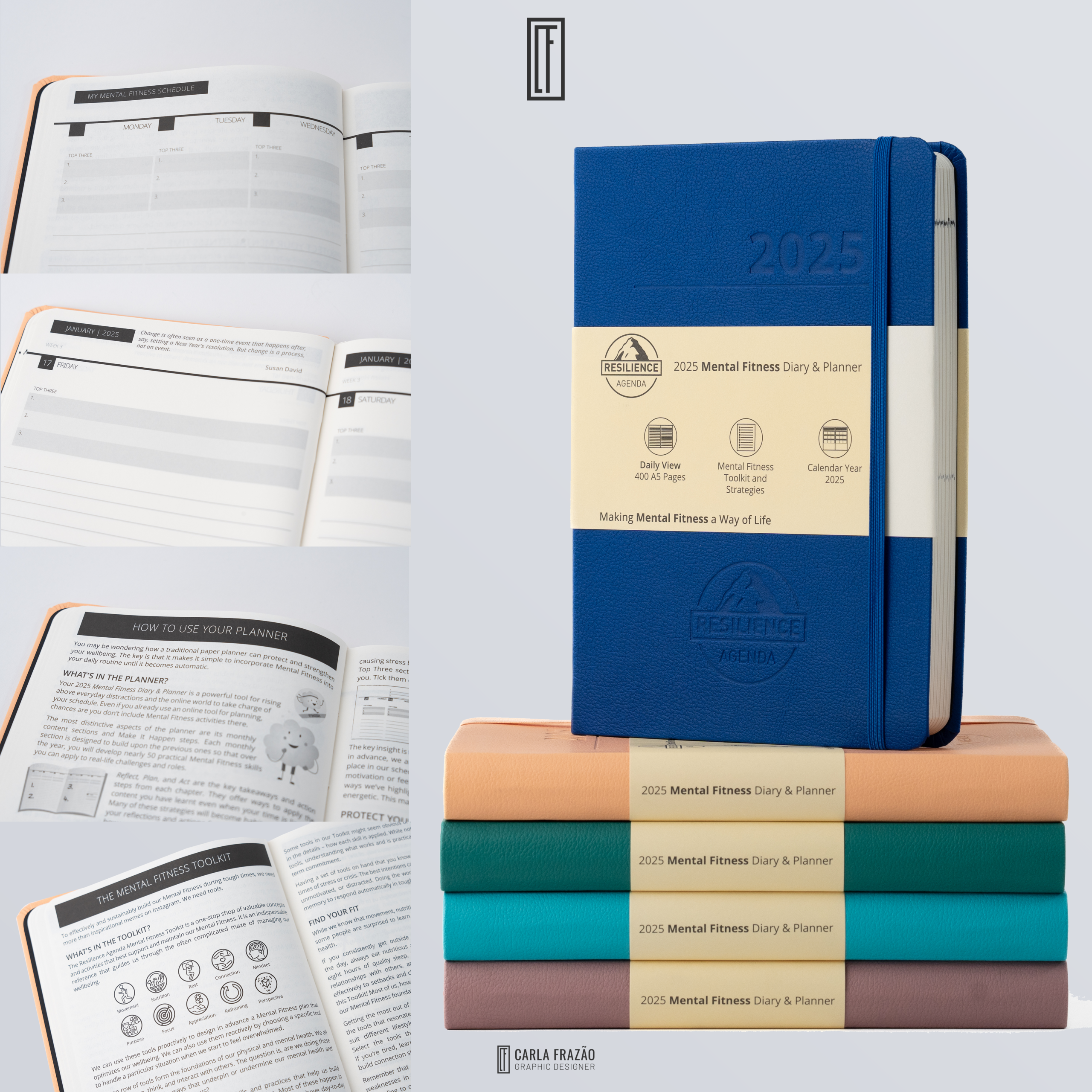
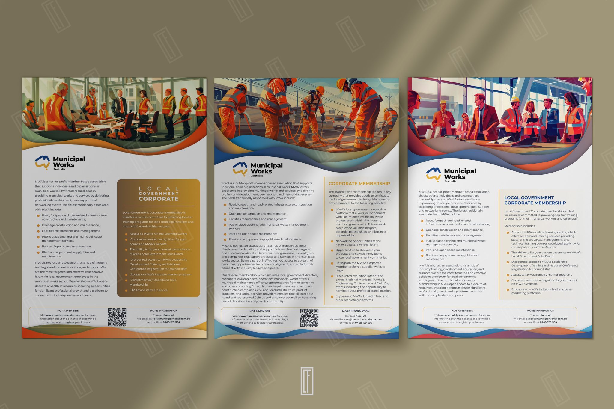
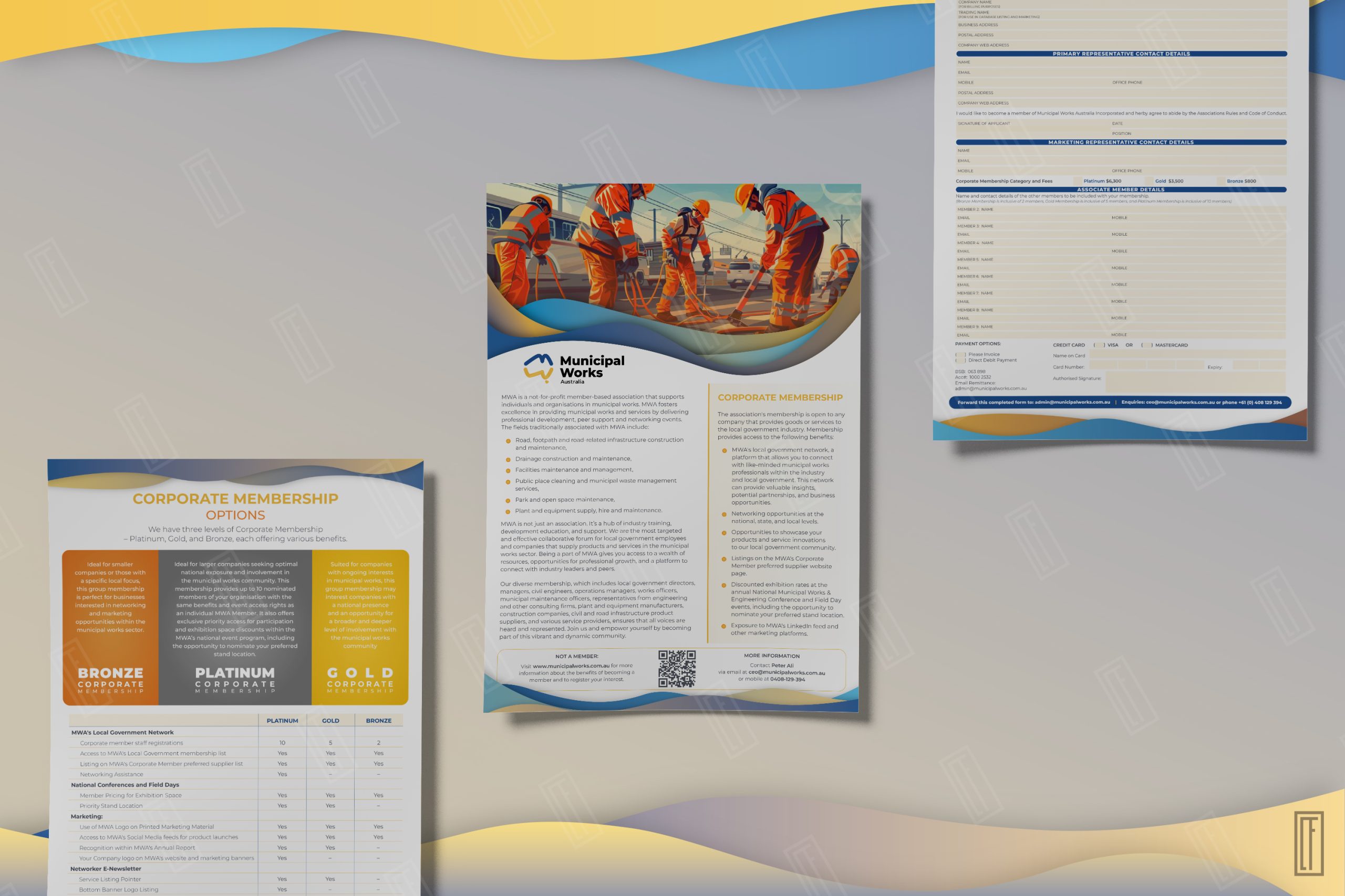
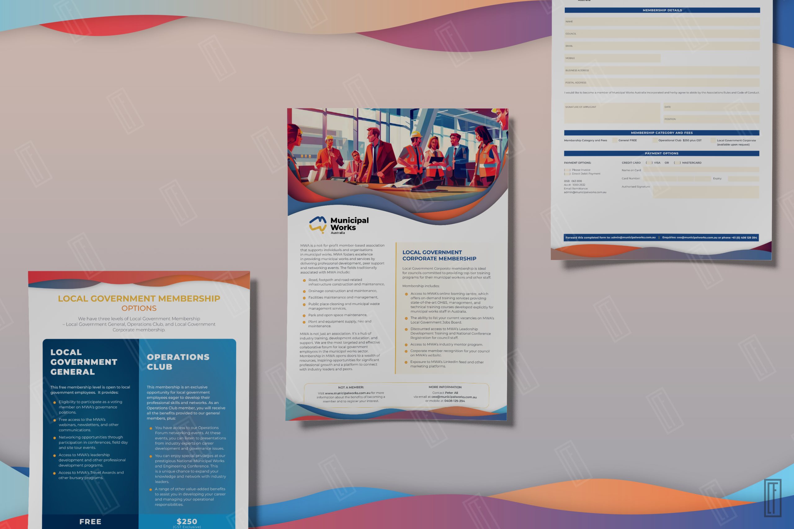
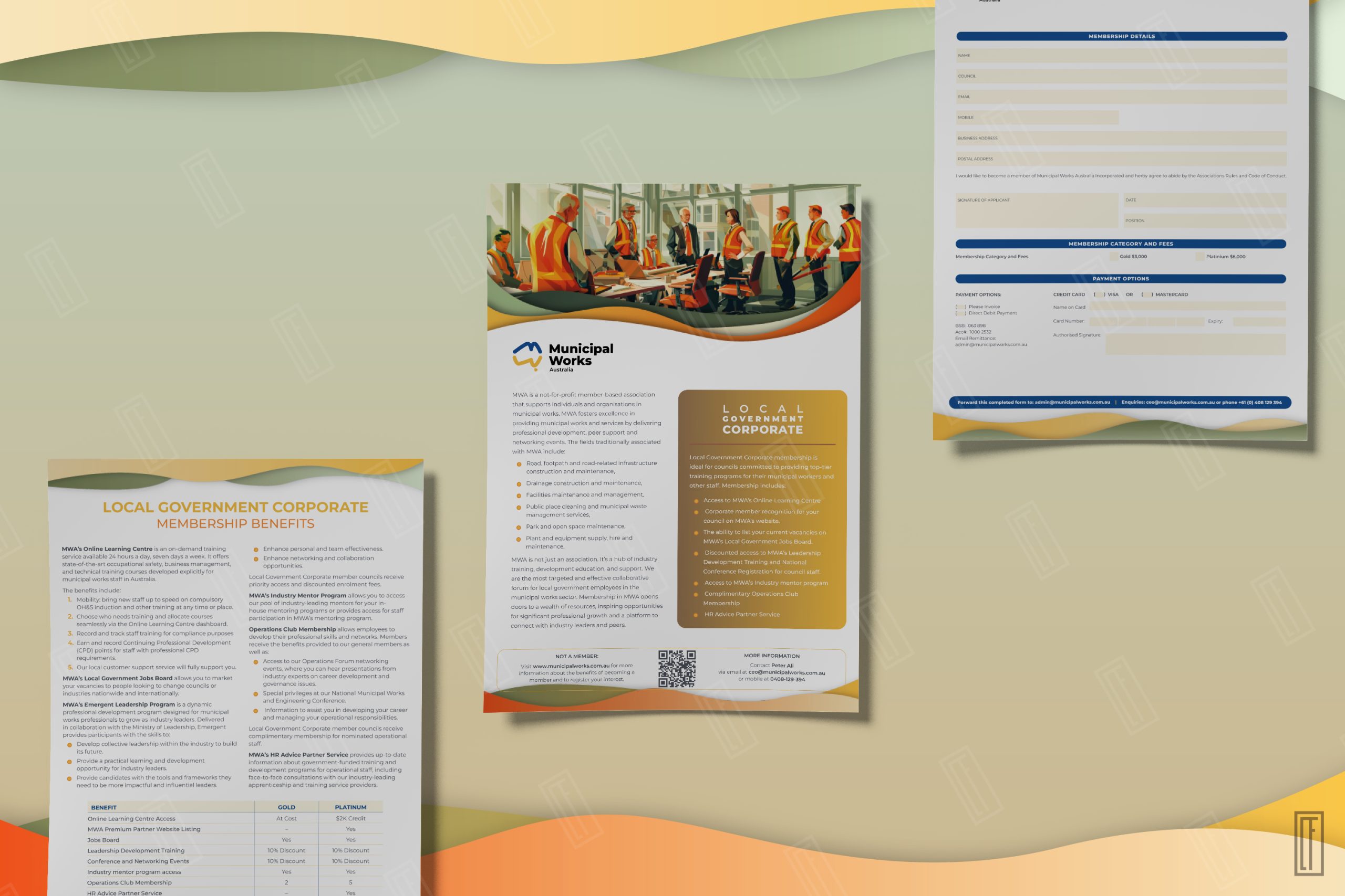
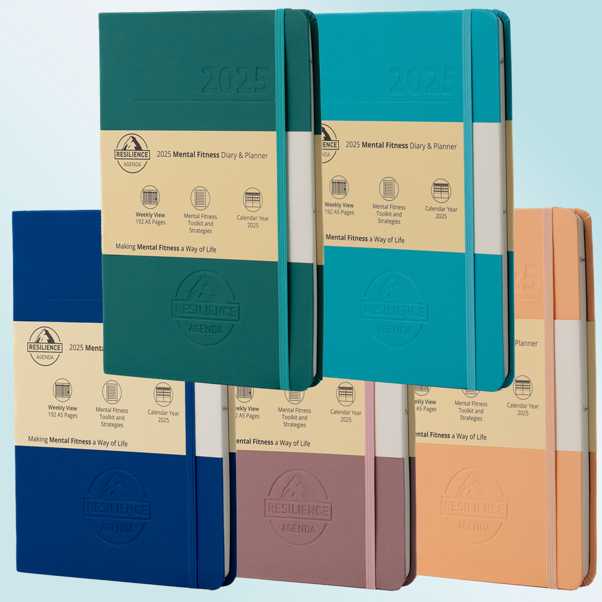
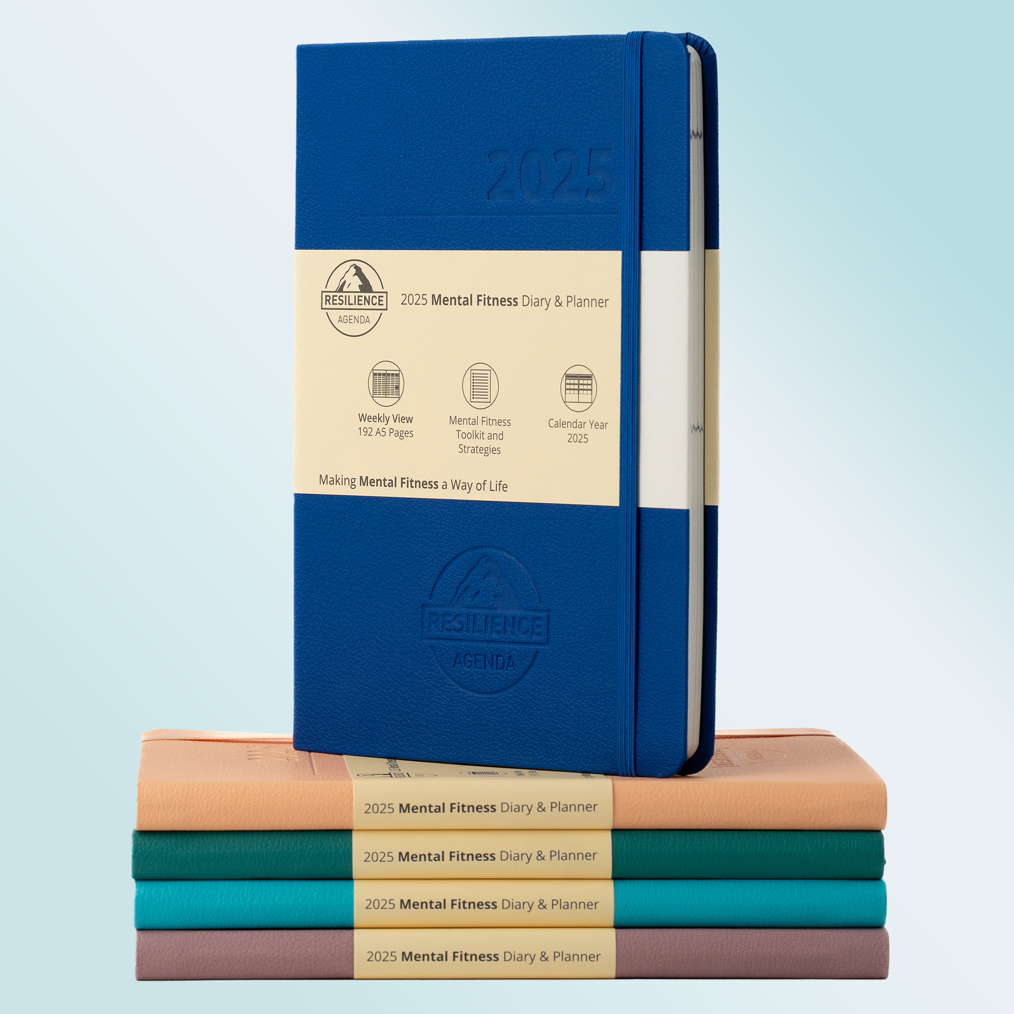
As the annual designer for Resilience Agenda's flagship product since 2020, I manage the complete production lifecycle of four market-specific diary variants: Australian and European editions, each available in daily and weekly formats.
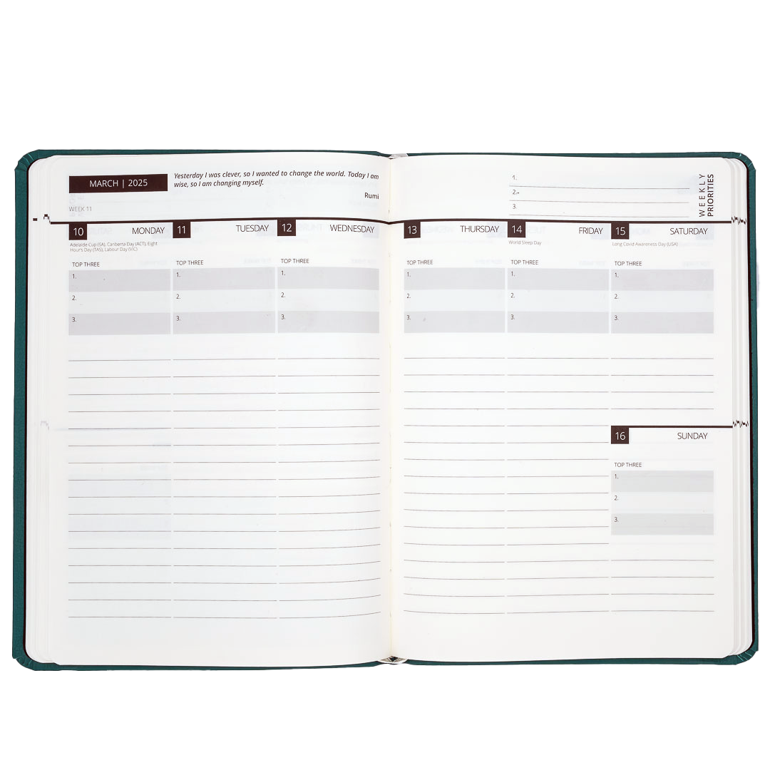
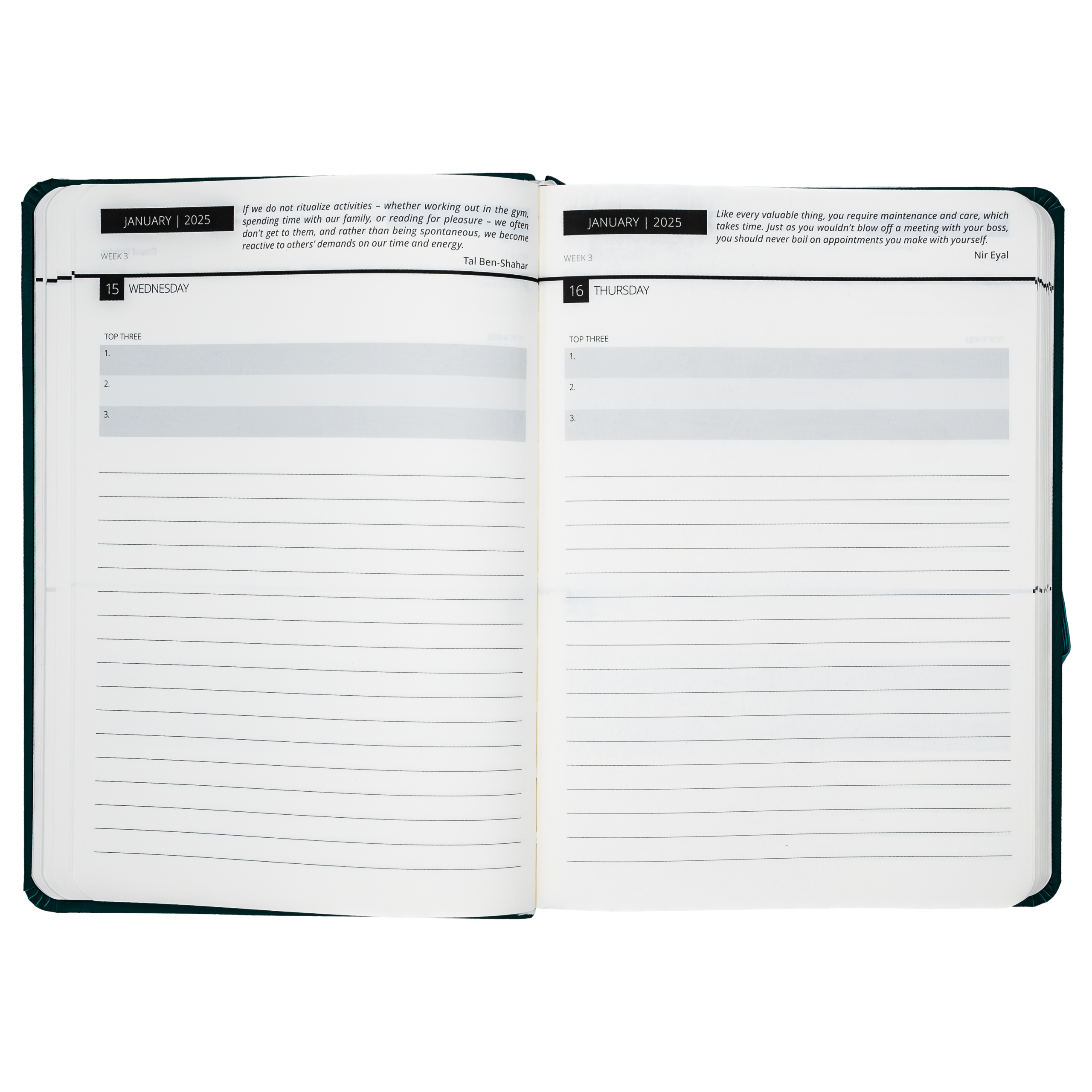
The project requires precise pagination across hundreds of pages, incorporating region-specific school holidays, public holiday calendars, and cultural date formatting. I handle layout design, typography refinement, image integration, and technical print specifications—ensuring flawless production for thousands of units annually.
The 2025 edition marks the sixth consecutive year of this partnership, with production workflows refined through accumulated knowledge of the product and printing requirements.
Deliverables: 4 Diary Variants, Belly Bands, Delivery Envelopes